
Serving Santa Barbara
Santa Barbara Web Design
Most Santa Barbara visits to your site happen on a phone, often on cellular, often while the person is already deciding whether to walk in. The page has a short window to load, make sense, and offer a tap.
The market
The Santa Barbara market
A visitor standing on Stearns Wharf or in the Funk Zone is not browsing the way a designer browses on a fast office connection. They have a hotel check-in, a hungry group, and a signal that drops when they turn away from the buildings. If your hero image is a six-megabyte sunset and the phone number is in a footer they will never reach, they will open the next listing.
We design and build marketing sites for businesses that live with that window. The work is information architecture, photography that is compressed on purpose, type you can read outdoors, and a call or booking action that does not require a desktop. Pretty is allowed. Pretty that fails on a 390-pixel screen is not finished.
Tourist decision time in this city is compressed. Someone who searched "lunch near me" on Cabrillo may be inside a restaurant a few minutes later. The site they tapped from Maps has to confirm they are in the right place (hours, address, a current photo of the room or the crew), then let them call or get directions without a scavenger hunt. Menu PDFs that are actually old scans, booking widgets that fail on iOS, and popups that cover the number are how those minutes go to a competitor.
Resident traffic behaves differently and still happens on a phone. A homeowner comparing two roofers at the kitchen table will scroll. They will look for license talk, service area, and a way to request a visit. They will not wait for a video background to buffer. They will leave if the contact form asks for a budget, a timeline, and a life story before they can say "call me." Santa Barbara sites often try to impress both audiences with the same cinematic homepage. The tourist bounces. The resident never finds the service list.
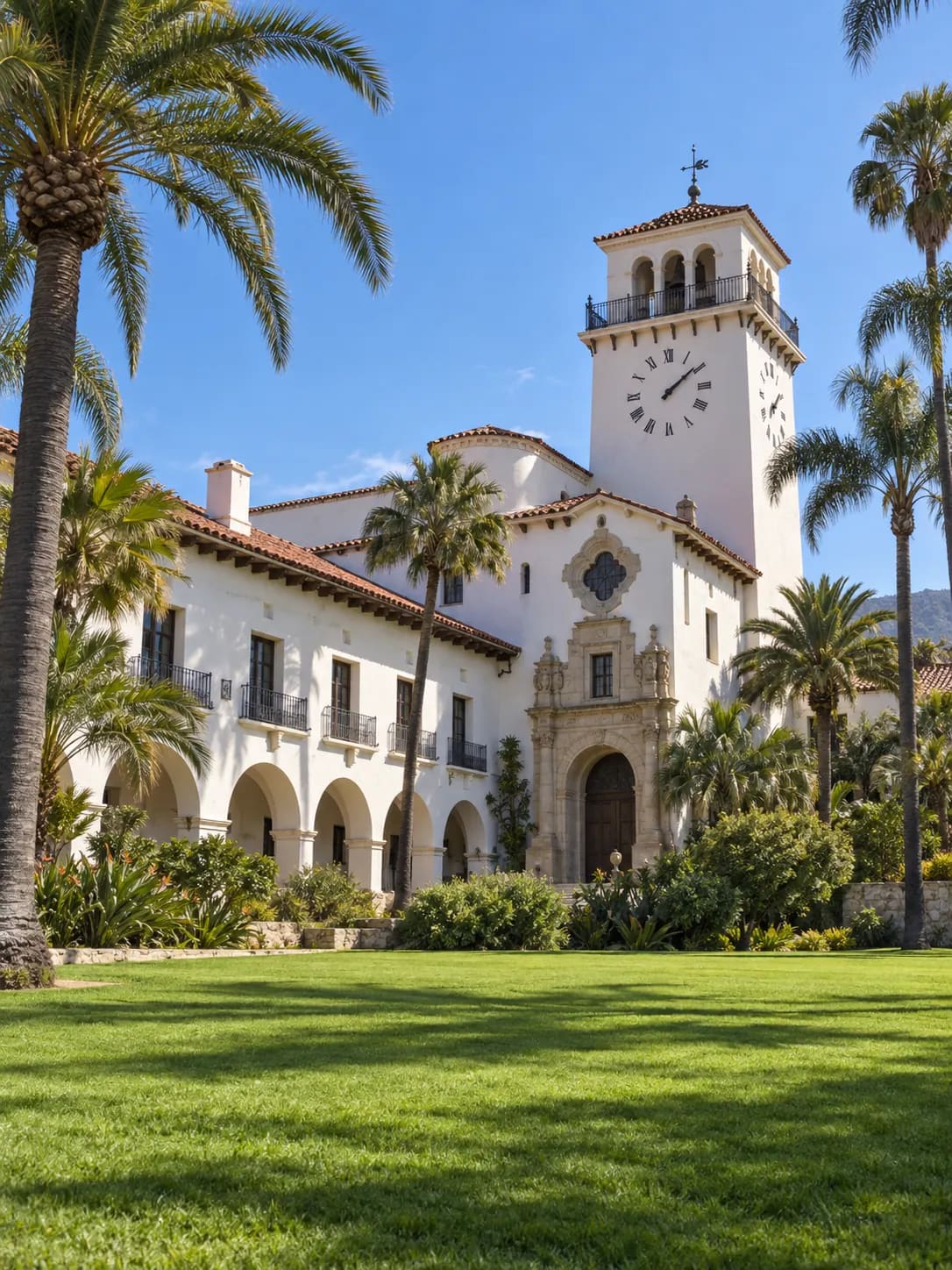
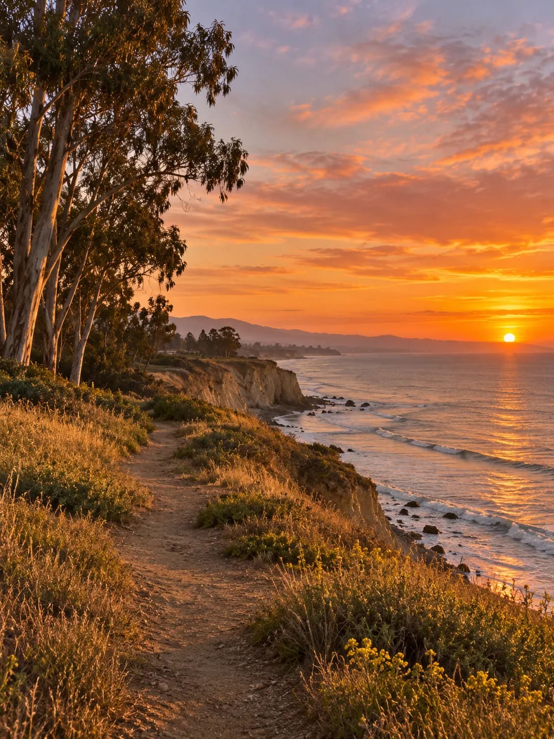
Photography is a local trap. This is a photogenic city. Owners want the harbor, the courthouse, the mountains. Stock-looking wide shots do not tell a visitor whether your patio is open or your exam room is real. We prefer original photos of the actual premises, compressed, with a focal point, and we keep decorative full-bleeds off the first paint. Brand can live in type, color, and a few well-chosen frames. It should not live in an unoptimized gallery that tanks Core Web Vitals.
Technical health is part of design here because Google uses page experience as a ranking input and because slow pages lose Maps traffic you already paid to earn. We build on a modern stack, not a page-builder theme with a plugin for every wish. Hosting, image pipeline, and form handling are specified up front. If a third-party chat or review widget is going to add two seconds, we will say so before it ships.
Neighborhoods
How Santa Barbara actually breaks apart
Downtown / State Street
Walk-in traffic. The site has to confirm hours and the tap-to-call target in the first screen.
Funk Zone
Evening light and group decisions. Pages need current hours, a real interior photo, and a reservation path that works on a phone.
Waterfront and Stearns Wharf
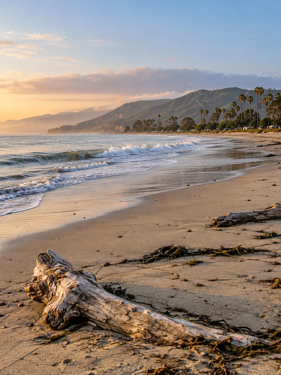
Weak cellular and glare. Large images and autoplay video are how you lose the tap from Maps.
Milpas
Bilingual households and quick local errands. Clear service lists beat a poetic homepage.
The Mesa
Residents on home Wi-Fi who still start on a phone. They will compare two sites. Yours has to be readable and specific.
Eastside
Practical queries. Show what you do, where you are, and how to reach you without a brand film first.
Westside
Trades and clinics. License, insurance talk, and a form that a person can complete one-handed.
Upper State
Professional services. A calm layout, a real staff photo, and a booking or call path that does not feel like a consumer app.
The Riviera
Discretion. Sites that scream "luxury template" feel off. Quiet, specific, and fast reads as more expensive than gold gradients.
Hope Ranch
Estate work found by referral and by search. The site has to look like it belongs in that conversation without inventing a pedigree.
On the ground
What works here
Cinematic homepages fail on Cabrillo
Harbor videos and uncompressed galleries look fine in a studio review and stall on cellular. We treat first-load weight as a design constraint, the same way we treat type size. If it cannot open quickly outdoors, it is not the homepage.
One story cannot serve a tourist and a retainer client
Hospitality and professional services in Santa Barbara often share a brand and should not share a first screen. We split templates and page types so the visitor sees hours and a tap, and the resident sees proof and a way to request work.
Third-party widgets eat the decision window
Chat, review carousels, booking iframes, and social feeds each add time. Some are worth it. Many are vanity. We add them only when they complete a job the owner can name, and we keep a fallback when the script fails.
Questions
Santa Barbara FAQs
Four to eight weeks is typical for a marketing site with a clear sitemap, if photos and copy arrive on time. Booking, multilingual content, or a large original photo library add time. We give a dated outline. If we are waiting on you, we say so. If you are waiting on us, you will know that too.
That is the design target. Readable type, compressed images, a tap target that actually calls you, and no popover covering the number. We check the layouts on small screens before we look at the laptop view. If a page only works on a laptop, it is unfinished.
No. We use a modern stack and original design for your business. Components get reused where they help speed and accessibility. You will not get a cloned "coastal restaurant" theme with the colors shifted. Santa Barbara already has too many of those.
If a meaningful share of your customers prefer Spanish, yes, and it should be real pages, not a machine-toggle that breaks the layout. Eastside and a lot of service businesses already live in both languages in person. The site should not pretend otherwise. We will scope translation as a distinct piece of work, not as a plugin afterthought.
It helps you keep the traffic Maps already sends, and page experience is one of many ranking inputs. It will not replace relevance, reviews, or a pin in the right place. We still treat speed as non-negotiable because a slow page wastes SEO you already have.

Let's talk about Santa Barbara.
A written 90-day plan for your pin, your category, and this city.